Understanding Spatial Segmentation
METASPACE Pro
Only available for METASPACE Pro users.
How it works
Spatial segmentation partitions the tissue section into molecularly distinct regions. Ion intensities are first normalised and log-transformed to put every pixel and ion on a comparable scale. PCA then reduces the normalised matrix to its principal patterns, summarising the molecular variation across all annotated ions into a compact set of axes. A spatial structure filter retains only the axes where neighbouring pixels tend to share similar values, discarding patterns driven by technical acquisition noise rather than tissue biology. A Gaussian Mixture Model (GMM) then clusters pixels based on their chemical profiles in the remaining spatially coherent axes — an approach adapted from Hu et al. (2021) [^1]. When no fixed number of clusters is specified, the optimal k is selected automatically using the Bayesian Information Criterion (BIC) elbow method. Each pixel is assigned a confidence score reflecting how clearly it belongs to its cluster. The method uses annotations rather than raw spectra as its features, which keeps the signal biologically interpretable.
Where to find it
Segmentation results are displayed on a dedicated results page, separate from the standard dataset viewer. The segmentation map appears once processing completes, with each colour representing a distinct molecular region.
How to read it
The segmentation map
Each colour on the map corresponds to one molecularly distinct region. The boundaries between colours reflect where the chemical composition of the tissue shifts meaningfully, not where it merely looks different visually.
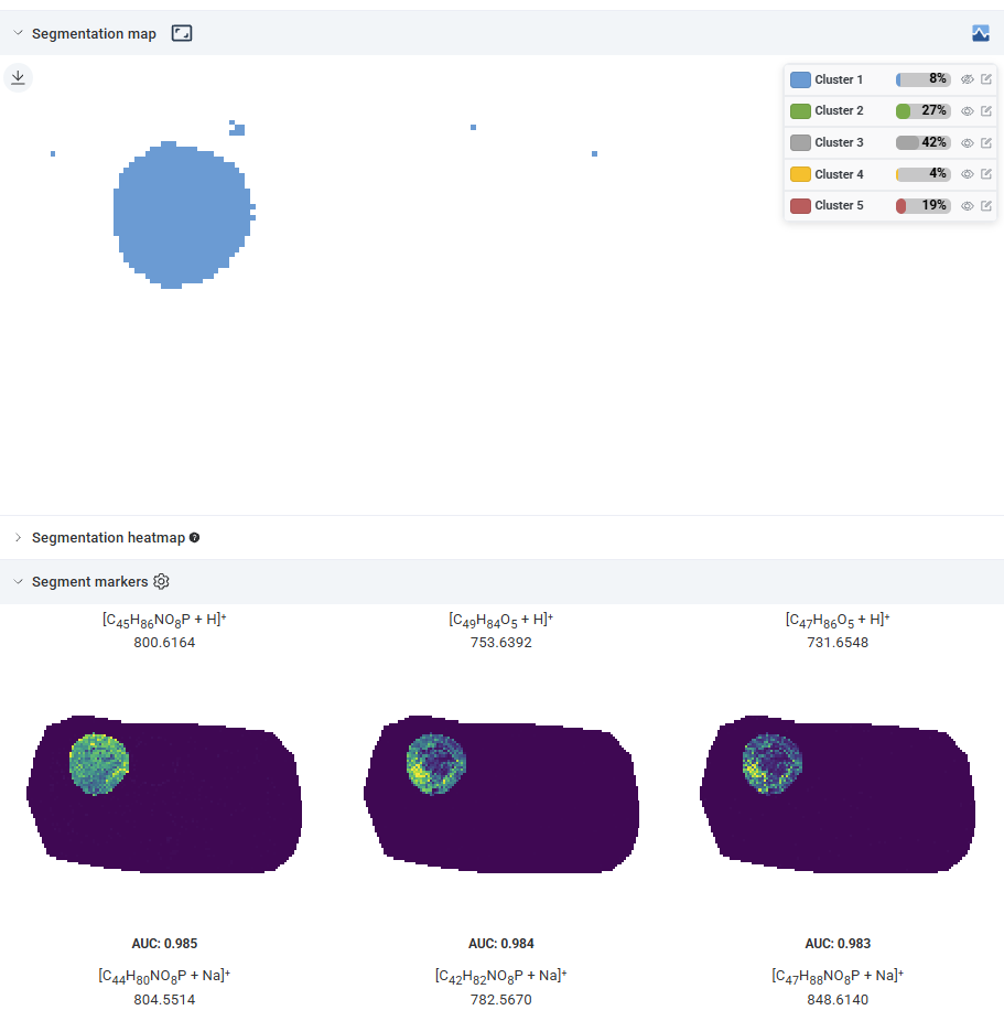 Cluster markers panel with a cluster selected, showing the top marker ions for that region. Source: dataset
The cluster markers panel has a cluster selector that lets you choose which cluster to inspect. The panel then lists the top marker ions for that cluster, ranked by how strongly each ion is enriched in it relative to the rest of the tissue. Browsing the marker ions is the primary way to assign biological meaning to each cluster.
The BIC curve
The BIC curve is only shown in the diagnostics panel when the number of clusters was determined automatically. If you specified k explicitly when running the segmentation, this panel is not displayed.
When shown, the BIC curve scores each candidate k: lower values indicate a better balance between fit and complexity. The selected k is the point of diminishing returns on the curve, where adding one more cluster stops meaningfully improving the fit. The curve typically continues declining past the selected k, so the selection is not the lowest point on the curve.
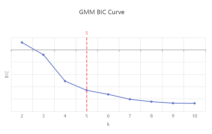 BIC curve showing the selected k at the elbow and the point where the curve levels off. Source: dataset
A curve that drops sharply and then levels off indicates a clean separation between tissue regions. A curve that continues declining gradually suggests more subtle molecular differences across the tissue. The selected k is the best automatic estimate, but you can override it on re-run if the biology suggests otherwise.
The confidence score distribution
Each pixel is assigned a confidence score reflecting how clearly it belongs to its assigned cluster versus neighbouring ones. Rather than displaying this per pixel, the diagnostics panel shows a histogram of confidence scores across all pixels in the dataset. The dashed line marks the peak of the distribution (the most common confidence value), not the statistical median.
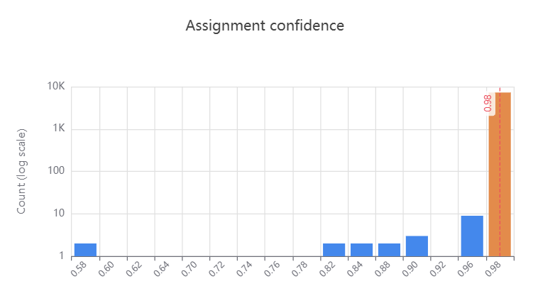 Confidence score histogram: high-confidence peak near 1.0, low-confidence tail near 0. Source: dataset
A histogram skewed toward 1 indicates that most pixels sit clearly within a single cluster. A broad or bimodal distribution suggests many pixels near boundaries between clusters, which is expected in tissues with gradual chemical transitions rather than sharp anatomical boundaries.
The heatmap
The heatmap shows the top 3 marker ions per cluster side by side. Each row is an ion and each column is a cluster. The colour in each cell reflects how strongly that ion is enriched in that cluster relative to the other ions shown for the same cluster — red indicates stronger enrichment, blue indicates weaker. This makes it easy to spot ions that are highly specific to one cluster versus those shared across several.
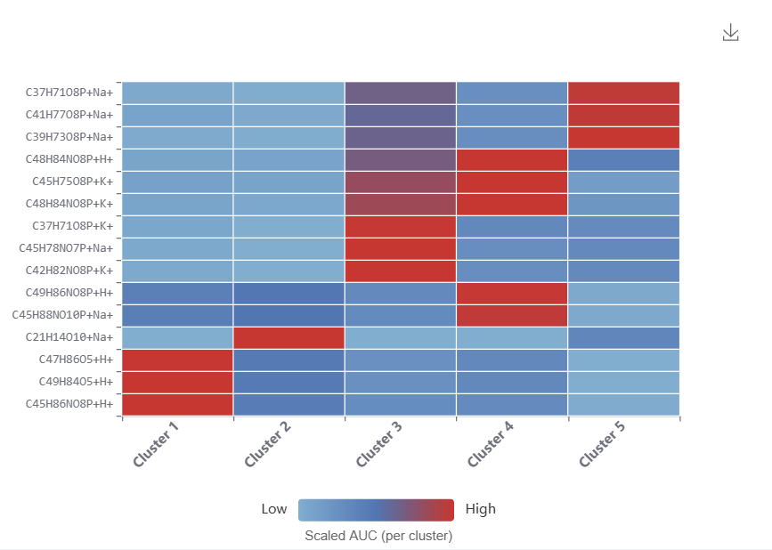 Heatmap of top marker ions per cluster, coloured by within-cluster enrichment score. Source: dataset
Common patterns and pitfalls
- More clusters than expected: this often reflects genuine sub-regional chemistry rather than over-fitting. Before concluding the result is too detailed, inspect the marker ions for each cluster. Metabolically distinct sub-regions may not be visually distinguishable by morphology.
- Very small clusters (a handful of pixels): can indicate outlier pixels rather than a true biological region. Check whether these pixels form a spatially coherent group or are scattered across the tissue.
- Low confidence across most of the tissue: suggests the chemical differences between regions are gradual rather than sharp. The segmentation map is still informative, but boundaries should be interpreted as approximate.
- Marker ions that don't make biological sense: the algorithm finds structure in whatever features are present. If low-quality annotations (high FDR) were included, they can drive spurious clusters. Consider re-running with a stricter FDR filter.
- BIC curve with no clear elbow (only when k is determined automatically): some tissues have a continuum of chemical variation rather than discrete zones. A flat BIC curve is informative in itself: it tells you that no single k captures the structure cleanly.
References
[^1]: Hu, H., Yin, R., Brown, H. M., & Laskin, J. (2021). Spatial Segmentation of Mass Spectrometry Imaging Data by Combining Multivariate Clustering and Univariate Thresholding. Analytical Chemistry, 93(7), 3477–3485. https://doi.org/10.1021/acs.analchem.0c04798